Manager UI (part 3): Team roster UI screen
3/27/2025
Martin Bozhilov
This is the third tutorial in the Manager UI series. In the previous tutorial, we laid the foundation for the Manager UI.
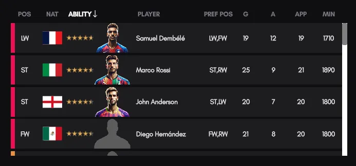
From now on, we will gradually add various UI screens to the Manager UI sample, starting with the Team Roster screen. This screen allows the player to view their team in a table format and rearrange rows either via drag-and-drop or by sorting any of the table columns.
If you wish to follow along, begin with the first tutorial of the series where we initialize and setup the project.
Additionally, you can find the complete Manager UI sample in the ${Gameface package}/Samples/uiresources/UITutorials/ManagerUI directory.
Overview
One of the key features of the Manager UI is its modularity and flexible screen arrangement. The Team Roster screen can be shrunk to a 1x1 grid, and its contents will adjust accordingly to display only the most important columns.
Main features
- Table with drag-and-drop functionality
- Data binding: Data is displayed from a mocked model
- Responsive UI - Resizes to fit smaller grid arrangements
- Scroll support
Model setup
First, we need to set up our mocked data using a model. Our model will consist of a players array that holds each player’s details—such as name, nationality,
and other key statistics. To begin, add the team-roster-model.js file to your models folder.
1const TeamRoster = {12 collapsed lines
2 players: [3 {4 name: "John Anderson",5 nationality: "gb-eng",6 ability: 4.5,7 type: "striker",8 preferred_positions: ["ST", "LW"],9 is_injured: false,10 goals: 20,11 assists: 7,12 clean_sheets: null,13 appearances: 20,14 minutes: 1800,15 image: "players/player-gb-eng.png",16 countryImage: "flags/gb-eng.svg",17 kit_number: 918 },19 {20 name: "Carlos Pérez",21 nationality: "es",22 ability: 4.2,23 type: "midfielder",24 preferred_positions: ["CM", "CAM"],25 is_injured: true,26 goals: 8,27 assists: 15,28 clean_sheets: null,29 appearances: 15,30 minutes: 1350,363 collapsed lines
31 image: "players/player-es.png",32 countryImage: "flags/es.svg",33 kit_number: 834 },35 {36 name: "Liam O'Connor",37 nationality: "ie",38 ability: 3.8,39 type: "defender",40 preferred_positions: ["CB", "SW"],41 is_injured: false,42 goals: 3,43 assists: 2,44 clean_sheets: null,45 appearances: 18,46 minutes: 1620,47 image: "players/player-ie.png",48 countryImage: "flags/ie.svg",49 kit_number: 550 },51 {52 name: "Michael Johnson",53 nationality: "us",54 ability: 4.0,55 type: "goalkeeper",56 preferred_positions: ["GK"],57 is_injured: false,58 goals: 0,59 assists: 1,60 clean_sheets: 12,61 appearances: 22,62 minutes: 1980,63 image: "players/player-us.png",64 countryImage: "flags/us.svg",65 kit_number: 166 },67 {68 name: "Marco Rossi",69 nationality: "it",70 ability: 4.6,71 type: "striker",72 preferred_positions: ["ST", "RW"],73 is_injured: false,74 goals: 25,75 assists: 9,76 clean_sheets: null,77 appearances: 21,78 minutes: 1890,79 image: "players/player-it.png",80 countryImage: "flags/it.svg",81 kit_number: 1082 },83 {84 name: "Victor Müller",85 nationality: "de",86 ability: 4.3,87 type: "midfielder",88 preferred_positions: ["DM", "CM"],89 is_injured: false,90 goals: 4,91 assists: 10,92 clean_sheets: null,93 appearances: 20,94 minutes: 1800,95 image: "players/player-de.png",96 countryImage: "flags/de.svg",97 kit_number: 698 },99 {100 name: "Felix Kim",101 nationality: "kr",102 ability: 3.9,103 type: "defender",104 preferred_positions: ["RB", "CB"],105 is_injured: false,106 goals: 1,107 assists: 3,108 clean_sheets: null,109 appearances: 16,110 minutes: 1440,111 image: "players/player-kr.png",112 countryImage: "flags/kr.svg",113 kit_number: 2114 },115 {116 name: "Samuel Dembélé",117 nationality: "fr",118 ability: 4.7,119 type: "striker",120 preferred_positions: ["LW", "FW"],121 is_injured: false,122 goals: 19,123 assists: 12,124 clean_sheets: null,125 appearances: 19,126 minutes: 1710,127 image: "players/player-fr.png",128 countryImage: "flags/fr.svg",129 kit_number: 7130 },131 {132 name: "Alejandro Vargas",133 nationality: "ar",134 ability: 4.4,135 type: "midfielder",136 preferred_positions: ["CAM", "LM"],137 is_injured: false,138 goals: 6,139 assists: 18,140 clean_sheets: null,141 appearances: 18,142 minutes: 1620,143 image: "players/player-unknown.png",144 countryImage: "flags/ar.svg",145 kit_number: 11146 },147 {148 name: "David Silva",149 nationality: "br",150 ability: 4.1,151 type: "goalkeeper",152 preferred_positions: ["GK"],153 is_injured: false,154 goals: 0,155 assists: 0,156 clean_sheets: 10,157 appearances: 20,158 minutes: 1800,159 image: "players/player-br.png",160 countryImage: "flags/br.svg",161 kit_number: 13162 },163 {164 name: "Yusuf Hassan",165 nationality: "eg",166 ability: 3.6,167 type: "defender",168 preferred_positions: ["LB", "LWB"],169 is_injured: false,170 goals: 0,171 assists: 4,172 clean_sheets: null,173 appearances: 17,174 minutes: 1530,175 image: "players/player-eg.png",176 countryImage: "flags/eg.svg",177 kit_number: 3178 },179 {180 name: "Tom Nguyen",181 nationality: "vn",182 ability: 4.0,183 type: "defender",184 preferred_positions: ["RB", "RWB"],185 is_injured: false,186 goals: 1,187 assists: 5,188 clean_sheets: null,189 appearances: 15,190 minutes: 1350,191 image: "players/player-unknown.png",192 countryImage: "flags/vn.svg",193 kit_number: 4194 },195 {196 name: "Ethan White",197 nationality: "ca",198 ability: 3.9,199 type: "midfielder",200 preferred_positions: ["DM", "CM"],201 is_injured: false,202 goals: 3,203 assists: 7,204 clean_sheets: null,205 appearances: 14,206 minutes: 1260,207 image: "players/player-unknown.png",208 countryImage: "flags/ca.svg",209 kit_number: 14210 },211 {212 name: "Ryo Tanaka",213 nationality: "jp",214 ability: 4.2,215 type: "midfielder",216 preferred_positions: ["RM", "CAM"],217 is_injured: false,218 goals: 5,219 assists: 9,220 clean_sheets: null,221 appearances: 19,222 minutes: 1710,223 image: "players/player-jp.png",224 countryImage: "flags/jp.svg",225 kit_number: 16226 },227 {228 name: "Moussa Traoré",229 nationality: "ci",230 ability: 3.8,231 type: "goalkeeper",232 preferred_positions: ["GK"],233 is_injured: true,234 goals: 0,235 assists: 0,236 clean_sheets: 6,237 appearances: 14,238 minutes: 1260,239 image: "players/player-unknown.png",240 countryImage: "flags/ci.svg",241 kit_number: 22242 },243 {244 name: "Emmanuel Okoro",245 nationality: "ng",246 ability: 3.7,247 type: "defender",248 preferred_positions: ["CB", "SW"],249 is_injured: false,250 goals: 0,251 assists: 2,252 clean_sheets: null,253 appearances: 16,254 minutes: 1440,255 image: "players/player-unknown.png",256 countryImage: "flags/ng.svg",257 kit_number: 15258 },259 {260 name: "Lucas Fernandes",261 nationality: "pt",262 ability: 4.0,263 type: "midfielder",264 preferred_positions: ["LM", "CM"],265 is_injured: false,266 goals: 4,267 assists: 6,268 clean_sheets: null,269 appearances: 18,270 minutes: 1620,271 image: "players/player-unknown.png",272 countryImage: "flags/pt.svg",273 kit_number: 12274 },275 {276 name: "Anders Berg",277 nationality: "se",278 ability: 3.9,279 type: "goalkeeper",280 preferred_positions: ["GK"],281 is_injured: false,282 goals: 0,283 assists: 0,284 clean_sheets: 8,285 appearances: 17,286 minutes: 1530,287 image: "players/player-unknown.png",288 countryImage: "flags/se.svg",289 kit_number: 21290 },291 {292 name: "Diego Hernández",293 nationality: "mx",294 ability: 4.5,295 type: "striker",296 preferred_positions: ["FW", "RW"],297 is_injured: false,298 goals: 21,299 assists: 8,300 clean_sheets: null,301 appearances: 20,302 minutes: 1800,303 image: "players/player-unknown.png",304 countryImage: "flags/mx.svg",305 kit_number: 17306 },307 {308 name: "Oscar Schmidt",309 nationality: "dk",310 ability: 3.8,311 type: "defender",312 preferred_positions: ["LB", "CB"],313 is_injured: false,314 goals: 1,315 assists: 3,316 clean_sheets: null,317 appearances: 15,318 minutes: 1350,319 image: "players/player-unknown.png",320 countryImage: "flags/dk.svg",321 kit_number: 18322 },323 {324 name: "Takumi Nakamura",325 nationality: "jp",326 ability: 4.2,327 type: "midfielder",328 preferred_positions: ["RM", "CM"],329 is_injured: true,330 goals: 6,331 assists: 9,332 clean_sheets: null,333 appearances: 19,334 minutes: 1710,335 image: "players/player-jp.png",336 countryImage: "flags/jp.svg",337 kit_number: 19338 },339 {340 name: "Ebrahim Khalid",341 nationality: "eg",342 ability: 4.1,343 type: "midfielder",344 preferred_positions: ["DM", "CM"],345 is_injured: true,346 goals: 2,347 assists: 5,348 clean_sheets: null,349 appearances: 14,350 minutes: 1260,351 image: "players/player-eg.png",352 countryImage: "flags/eg.svg",353 kit_number: 20354 },355 {356 name: "Pablo Alvarez",357 nationality: "cl",358 ability: 3.9,359 type: "defender",360 preferred_positions: ["CB", "SW"],361 is_injured: false,362 goals: 0,363 assists: 2,364 clean_sheets: null,365 appearances: 16,366 minutes: 1440,367 image: "players/player-unknown.png",368 countryImage: "flags/cl.svg",369 kit_number: 24370 },371 {372 name: "Luka Petrovic",373 nationality: "rs",374 ability: 4.0,375 type: "striker",376 preferred_positions: ["ST", "LW"],377 is_injured: false,378 goals: 15,379 assists: 6,380 clean_sheets: null,381 appearances: 18,382 minutes: 1620,383 image: "players/player-unknown.png",384 countryImage: "flags/rs.svg",385 kit_number: 23386 },387 {388 name: "Ahmed Mansour",389 nationality: "jo",390 ability: 3.7,391 type: "goalkeeper",392 preferred_positions: ["GK"],393 is_injured: false,394 goals: 0,395 assists: 0,396 clean_sheets: 5,397 appearances: 12,398 minutes: 1080,399 image: "players/player-unknown.png",400 countryImage: "flags/jo.svg",401 kit_number: 25402 }403 ],404}405export default TeamRoster;Next, create the model in your project by updating your model index file as follows:
1import GridDataModel from './grid-data-model';2import TeamRosterModel from './team-roster-model';3
4engine.whenReady.then(() => {5    engine.createJSModel('GridData', GridDataModel);6    engine.createJSModel('TeamRosterModel', TeamRosterModel);7});
From now on, we will refer to this model as TeamRosterModel.
UI structure setup
We’ll organize all UI screens displayed in the grid by placing them in a dedicated Screens folder.
In this folder, create a new component called TeamRoster.tsx, which will serve as the main component for this UI screen.
Below is the code for the TeamRoster.tsx component:
1import styles from './TeamRoster.module.css';2import { Component } from "solid-js";3import Scroll from "@components/Layout/Scroll/Scroll";4import TableHeader from "./TableHeader";5import TableRow from "./TableRow";6import './globalTeamRoster.css'7import Layout from "@components/Layout/Layout/Layout";8
9const TeamRoster: Component = () => {10
11    return (12        <Layout class={styles.TeamRoster}>13            <TableHeader  />14            <Scroll>15                <TableRow />16            </Scroll>17        </Layout>18    )19}20
21export default TeamRoster
And here’s the corresponding CSS:
1.TeamRoster {2    background-color: #0F0F11;3    display: flex;4    flex-direction: column;5}6
7.ScrollContainer {8    max-width: 100%;9    flex: 1;10}
Component Breakdown
TableHeader- Handles the table’s header and sorting functionality.TableRow- Displays the players’ information.
Both components will have the same structure and we are going to acheive this with the help of the Column GameFace UI components.
Disable grid interactions when scrolling
One thing we must do before enabling any interactions within the TeamRoster component is to disable the grid drag and drop behavior when the player clicks on the
scroll bar of the Scroll component.
Since the Gameface UI components are directly imported from the components folder,
we can go to the implementation of the
Scroll component and add what we need there.
Inside the onHandleMouseDown and onHandleMouseUp we will disable and enable the shouldDrag state respectively:
1function onHandleMouseDown(e: MouseEvent) {4 collapsed lines
2 startY = e.clientY;3 startScrollTop = contentRef!.scrollTop;4 window.addEventListener("mousemove", onHandleMouseMove);5 window.addEventListener("mouseup", onHandleMouseUp);6
7 // custom modification8 gridInteractionState.shouldDrag = false;9}1function onHandleMouseUp() {2 window.removeEventListener("mousemove", onHandleMouseMove);3 window.removeEventListener("mouseup", onHandleMouseUp);4
5 // custom modification6 gridInteractionState.shouldDrag = true;7}Now we can proceed with the main part of the UI.
Display player’s data
In this section, we’ll create the TableRow component, which is responsible for displaying our team data in a row format.
The component defines the row structure once and then uses the data-bind-for attribute to loop through the players from the model,
dynamically displaying each player’s information.
Additionally we utilize both
structural
data-bind attributes ,
and a
custom data-bind
attribute to managa data-binding.
Displaying player data and controlling the size
The TableRow component uses a prop called sizeExpression to determine which columns to show based on the current screen size.
When the UI is resized to a 1x1 grid, the sizeExpression condition hides less critical columns, ensuring that only the most important player details are visible.
The component is built using various GameFace UI components such as
Column1,
Column4,
Row,
Flex, and
Block
1import { Column1, Column4 } from "@components/Layout/Column/Column";2import Row from "@components/Layout/Row/Row";3import styles from './TeamRoster.module.css';4import Flex from "@components/Layout/Flex/Flex";5import Block from "@components/Layout/Block/Block";6import Relative from "@components/Layout/Relative/Relative";7import Image from "@components/Media/Image/Image";8import InjuredIcon from '@assets/misc/injured.svg';9
10const TableRow = (props: {sizeExpression: string}) => {11    return (12        <Row13            data-bind-for={'index, player:{{TeamRosterModel.players}}'}14            class={styles.PlayerRow}15            data-bind-mousedown="playerMouseDown(this, event, {{index}})"16            data-bind-mouseenter="playerMouseEnter(this, {{index}})"17            data-bind-mouseleave="playerMouseLeave(this)"18            >19            <Column1 data-bind-class-toggle={`Column-Position:${props.sizeExpression}`} class={`${styles.Column}`}>20                <Relative>21                    <Flex align-items="center" justify-content="center" style={{width: '100%', height: '100%'}}>22                        <Block class={styles.PositionTag} data-bind-class="'player-role-'+{{player.type}}"></Block>23                        <Block data-bind-value="{{player.preferred_positions[0]}}"></Block>24                    </Flex>25                </Relative>26            </Column1>27            <Column1 data-bind-class-toggle={`Column-Nationality:${props.sizeExpression}`} class={`${styles.Column}`}>28                <Block class={styles.FlagImage} data-bind-background-image="{{player.countryImage}}"></Block>29            </Column1>30            <Column1 data-bind-class-toggle={`Column-Ability:${props.sizeExpression}`} class={`${styles.Column}`}>31                <Block data-bind-style-background-position-x="100-(20*{{player.ability}}) + '%'" class={styles.Ability}></Block>32            </Column1>33            <Column4 data-bind-class-toggle={`Column-Player:${props.sizeExpression}`} class={`${styles.Column}`}>34                <Flex align-items="center" style={{ width: '100%', height: '100%', "padding-right": '0.4vmax'}}>35                    <Block data-bind-background-image="{{player.image}}" class={styles.PlayerImage}></Block>36                    <Flex style={{flex: '1'}} align-items="center" >37                        <Block class={styles.PlayerName} data-bind-value="{{player.name}}"></Block>38                        <Image data-bind-if="{{player.is_injured}}" src={InjuredIcon} class={styles.InjuredIcon} />39                    </Flex>40                </Flex>41            </Column4>42            <Column1 data-bind-class-toggle={`hidden:${props.sizeExpression}`} data-bind-value="{{player.preferred_positions}}" class={styles.Column}></Column1>43            <Column1 data-bind-class-toggle={`hidden:${props.sizeExpression}`} data-bind-value="{{player.goals}}" class={styles.Column}></Column1>44            <Column1 data-bind-class-toggle={`hidden:${props.sizeExpression}`} data-bind-value="{{player.assists}}" class={styles.Column}></Column1>45            <Column1 data-bind-class-toggle={`hidden:${props.sizeExpression}`} data-bind-value="{{player.appearances}}" class={styles.Column}></Column1>46            <Column1 data-bind-class-toggle={`hidden:${props.sizeExpression}`} data-bind-value="{{player.minutes}}" class={styles.Column}></Column1>47        </Row>48    )49}50
51export default TableRow
Let’s also add the styles:
1.PlayerRow {2    align-items: center;3    height: 3vmax;4    margin-bottom: 0.25vmax;5    background-color: #1D1D20;6    flex-wrap: nowrap;7}8
9.Column {10    font-size: 0.70vmax;11    text-align: center;12}13
14.PositionTag {15    position: absolute;16    left: 0;17    width: 15%;18    height: 100%;19}20
21.FlagImage {22    width: 70%;23    height: 100%;24    background-position: center;25    background-repeat: no-repeat;26    background-size: contain;27}28
29.Ability {30    width: 100%;31    height: 100%;32    background: linear-gradient(90deg, #E4AC59 0%, #E4AC59 50%, #646464 50%, #646464 100%);33    mask-image: url('@assets/misc/Stars.svg');34    mask-size: 100% 100%;35    mask-position: 0% 50%;36    mask-repeat: no-repeat;37    background-size: 200% 100%;38    background-position: 50% 0;39}40
41.PlayerImage {42    min-width: 35%;43    height: 100%;44    background-position: center;45    background-repeat: no-repeat;46    background-size: contain;47}48
49.PlayerName {50    padding-left: 0.5vmax;51    padding-right: 0.3vmax;52}53
54.InjuredIcon {55    width: 0.5vmax;56    height: 0.5vmax;57}
Here’s a brief overview of what each part of the row does:
- Player Position: A column that displays a position tag. It dynamically assigns a CSS class based on the player’s role (e.g., striker, midfielder) to change the tag’s background color.
- Nationality: A column that shows the player’s flag. A custom data-bind attribute (
data-bind-player-country-image) is used to dynamically set the background image to the correct flag icon. - Ability: A column that displays a block with a gradient background. The background’s position is dynamically calculated based on the player’s ability.
- Player Information: This section displays the player’s image, name, and an injured icon if the player is injured.
- Additional Details: Several columns display extra information such as preferred positions, goals, assists, appearances, and minutes. These columns are conditionally hidden when the screen is in a minimized (1x1) state.
Because CSS modules resolve class names at runtime, we cannot directly use them with our data-binding expressions.
To work around this, we define an additional global CSS file (globalTeamRoster.css) that includes utility classes (like .hidden) and classes for conditionally
styling columns (such as .Column-Position, .Column-Nationality, etc.). This global CSS file also defines the color schemes for player roles.
1/* utility */2.hidden {3 display: none;4}38 collapsed lines
5
6/* Column small screen width override */7.Column-Position {8 flex-basis: 12%;9 max-width: 12%;10}11
12.Column-Nationality {13 flex-basis: 12%;14 max-width: 12%;15}16
17.Column-Ability {18 flex-basis: 20%;19 max-width: 20%;20}21
22.Column-Player {23 flex-basis: 55%;24 max-width: 55%;25}26
27/* Player Tag */28.player-role-striker {29 background-color: var(--main-red);30}31
32.player-role-midfielder {33 background-color: var(--main-orange);34}35
36.player-role-defender {37 background-color: var(--main-light-green);38}39
40.player-role-goalkeeper {41 background-color: var(--main-teal);42}We have also defined some of the main colors that will be used throughout this project as CSS variables
1:root {2 --main-red: #ED1054;3 --main-orange: #EA8F43;4 --main-light-green: #B6F52E;5 --main-teal: #23E6A1;6}After setting up the TableRow component, remember to update the parent TeamRoster component to pass the sizeExpression prop to both the TableHeader and TableRow
components. This ensures that the table’s layout responds correctly when the screen size changes.
1const TeamRoster: Component = () => {2    const sizeExpression = "{{GridData.gridItems[0].sizeX}} === 1";3
4return (5    <Layout class={styles.TeamRoster}>6            <TableHeader />7            <TableHeader sizeExpression={sizeExpression} />8        <Scroll ref={scrollRef} class={styles.ScrollContainer}>9            <TableRow />10            <TableRow sizeExpression={sizeExpression} />11        </Scroll>12    )13}
Resolving image imports with custom data-bind attribute
To easily import images from our model in a vite project such as this one, we can leverage a custom data-bind attribute.
We are going to create a data-bind-background-image attribute which will get the string path to the image and resolve the import at runtime.
For this purpose, we will need to add a utility function that will help us resolve static file import paths.
1export function getImageUrl(name: string) {2 return new URL(`../assets/${name}`, import.meta.url).href3}getImageUrl will give us the correct path to the assets folder both in development and production.
Now let’s implement the custom data-binding class:
1import { getImageUrl } from '../index'2
3class BackgroundImage {4
5    init(element, value) {6        element.style.backgroundImage = `url(${getImageUrl(value)})`7    }8
9    deinit(element) {}10
11    update(element, value) {12        element.style.backgroundImage = `url(${getImageUrl(value)})`13    }14}15
16engine.whenReady.then(() => {17    engine.registerBindingAttribute("background-image", BackgroundImage);18})
The logic is pretty simple - we are just setting the background image url of the element by accepting a value argument, which we expect to be a valid path to an image in our
assets folder, for example: players/player-de.png.
With these changes, the team data from the model is rendered in a table-like format that is both dynamic and responsive.
Sorting the players
Now that we have displayed our model’s data, it’s time to add interactions. The first interaction we’re implementing is sorting the rows. To achieve this, we need to create a table header.
Table header structure
We create a TableHeader component to handle all the sorting logic.
This component also utilizes the GameFace UI’s Column components as is done for the TableRow. It also manages the sorting state using two signals:
currentSort- The column we are currently sorting by (set to ability by default)asc- The order of the sort (set to ascending by default)
1import { Column1, Column4 } from "@components/Layout/Column/Column";2import Row from "@components/Layout/Row/Row";3import styles from './TeamRoster.module.css';4import HeaderColumn from "./HeaderColumn";5import { createSignal, onMount } from "solid-js";6
7const TableHeader = (props: {sizeExpression: string}) => {8    const [asc, setAsc] = createSignal(true);9    const [currentSort, setCurrentSort] = createSignal<sortType>('ability')10
11    return (12        <Row class={styles.Header}>13            <Column1 data-bind-class-toggle={`Column-Position:${props.sizeExpression}`} class={styles.Column}>14                <HeaderColumn sortBy="type" handleSort={handleSort} currentSort={currentSort} asc={asc}>POS</HeaderColumn>15            </Column1>16            <Column1 data-bind-class-toggle={`Column-Nationality:${props.sizeExpression}`} class={styles.Column}>17                <HeaderColumn sortBy="nationality" handleSort={handleSort} currentSort={currentSort} asc={asc}>NAT</HeaderColumn>18            </Column1>19            <Column1 data-bind-class-toggle={`Column-Ability:${props.sizeExpression}`} class={styles.Column}>20                <HeaderColumn sortBy="ability" handleSort={handleSort} currentSort={currentSort} asc={asc}>ABILITY</HeaderColumn>21            </Column1>22            <Column4 data-bind-class-toggle={`Column-Player:${props.sizeExpression}`} class={styles.Column}>23                <HeaderColumn sortBy="name" handleSort={handleSort} currentSort={currentSort} asc={asc}>PLAYER</HeaderColumn>24            </Column4>25            <Column1 data-bind-class-toggle={`hidden:${props.sizeExpression}`} class={styles.Column}>PREF POS</Column1>26            <Column1 data-bind-class-toggle={`hidden:${props.sizeExpression}`} class={styles.Column}>27                <HeaderColumn sortBy="goals" handleSort={handleSort} currentSort={currentSort} asc={asc}>G</HeaderColumn>28            </Column1>29            <Column1 data-bind-class-toggle={`hidden:${props.sizeExpression}`} class={styles.Column}>30                <HeaderColumn sortBy="assists" handleSort={handleSort} currentSort={currentSort} asc={asc}>A</HeaderColumn>31            </Column1>32            <Column1 data-bind-class-toggle={`hidden:${props.sizeExpression}`} class={styles.Column}>33                <HeaderColumn sortBy="appearances" handleSort={handleSort} currentSort={currentSort} asc={asc}>APP</HeaderColumn>34            </Column1>35            <Column1 data-bind-class-toggle={`hidden:${props.sizeExpression}`} class={styles.Column}>36                <HeaderColumn sortBy="minutes" handleSort={handleSort} currentSort={currentSort} asc={asc}>MIN</HeaderColumn>37            </Column1>38        </Row>39    )40}41
42export default TableHeader
We are once again utilizng the data-bind-class-toggle to conditionally hide some of the columns when the UI shrinks.
Inside the same component, you’ll notice that each header column leverages the HeaderColumn component.
This component serves as a wrapper for the column buttons, handling the sort action and displaying an arrow icon to indicate whether the sort order is ascending or descending.
1import Flex from "@components/Layout/Flex/Flex"2import { Accessor, createEffect, createSignal, ParentComponent, Show } from "solid-js"3import styles from './TeamRoster.module.css';4import {sortType} from '../../../types/types';5
6interface Props {7    currentSort: Accessor<sortType>,8    asc: Accessor<boolean>,9    handleSort: (key: sortType) => void,10    sortBy: sortType11}12
13const HeaderColumn: ParentComponent<Props> = (props) => {14    const [isActive, setIsActive] = createSignal()15
16    createEffect(() => {17        const active = props.currentSort() === props.sortBy;18        setIsActive(active);19    });20
21    const clickHanlder = () => {22        props.handleSort(props.sortBy)23    }24
25    return (26        <Flex align-items="center" justify-content="center" class={styles['Header-Button']} click={clickHanlder}>27            <Flex align-items="center" class={`${isActive() ? styles.ActiveCol : ''} ${props.asc() ? styles.asc: ''}`}>{props.children}</Flex>28        </Flex>29    )30}31
32export default HeaderColumn
The HeaderColumn component will accept the following props:
currentSort- The column we are currently sorting byasc- The order of the sorthandleSort- The function to execute the table sortsortBy- The unique string associated with every column to sort by.
On sort change we are going to check if the current sort is equal to the column’s sort value and if it is we are going to set it as active and applying an active class.
The active class will also display an arrow pointing up or down depending on the sort order.
1.Header {2    font-size: 0.75vmax;3    padding: 0.5vmax 0;4    padding-right: 10px;5    color: #7C7C84;6    background-color: #0F0F11;7    font-weight: bold;8    flex-wrap: nowrap;9    white-space: nowrap;10}11
12.Header-Button {13    cursor: pointer;14    width: 100%;15}16
17.Header-Button:hover,18.Header-Button:focus {19    color: white;20}21
22.ActiveCol {23    color: white;24    padding: 0;25    position: relative;26}27
28.ActiveCol::after {29    content: '';30    width: 0.75vmax;31    height: 0.75vmax;32    position: absolute;33    right: -0.75vmax;34    background-image: url('@assets/misc/Arrow.svg');35    background-size: 100% 100%;36    background-repeat: no-repeat;37    transition: transform 0.2s ease-in-out;38}39
40.ActiveCol.asc::after {41    transform: rotate(180deg);42}
And lastly, let’s declare the sortType:
1export type sortType = 'name' | 'nationality' | 'ability' | 'type' | 'goals' | 'assists' | 'clean_sheets' | 'appearances' | 'minutes';With that we should now be able to see our table header displayed.
Sorting logic
The sorting functionality is implemented via a handleSort function in the TableHeader component. Here’s a quick overview of what the function does:
- Toggle Sort Order: If the column clicked is already the active sort column, the sort order toggles (ascending ↔ descending).
- Sort Players: The function then sorts the players array in the
TeamRosterModel. Because sorting methods differ for strings and numbers, anumericKeysarray is used to determine if the current sort key should be treated numerically or as a string. - Update Model and State: After sorting, the model is updated (using the
updateModelutility function), and thecurrentSortstate is set to the newly sorted column for visual feedback.
Since sorting between string and number values is not performed the same way, we will create a numericKeys array to easily check if the sorting will be by numbers or strings
1import { createSignal, onMount } from "solid-js";2import { updateModel } from "../../../../src/utils";3import { sortType } from "src/types/types";4
5const numericKeys: sortType[] = ['ability', 'goals', 'assists', 'clean_sheets', 'appearances', 'minutes'];6
7const TableHeader = (props: {sizeExpression: string}) => {8    const [asc, setAsc] = createSignal(true);9    const [currentSort, setCurrentSort] = createSignal<sortType>('ability')10
11    const handleSort = (key: sortType) => {12        currentSort() === key ? setAsc(prev => !prev) : '';13        sortPlayers(key);14        setCurrentSort(key);15    }16
17    const sortPlayers = (key: sortType) => {18        TeamRosterModel.players.sort((a, b) => {19            const aValue = a[key] ?? 0;20            const bValue = b[key] ?? 0;21
22            if (numericKeys.includes(key)) {23                return asc() ?24                    (aValue as number) - (bValue as number) :25                    (bValue as number) - (aValue as number);26            } else {27                return asc() ?28                    String(aValue).localeCompare(String(bValue)) :29                    String(bValue).localeCompare(String(aValue))30            }31        });32        updateModel(TeamRosterModel);33    }34
35    return (36        <Row class={styles.Header}>37        {/* Rest of component */}
Additionally, we call the handleSort function inside an onMount hook to ensure the table is initially sorted as soon as the component mounts:
1onMount(() => {2 // Sort initially3 handleSort(currentSort())4})With these enhancements, the table header now not only displays the appropriate labels but also allows you to sort the table by clicking on the header cells. The active sorting column is highlighted with an arrow indicating the sort direction, and the table rows update accordingly.
Drag and drop player’s row
The final functionality in our UI is enabling row drag and drop, allowing users to swap rows by dragging them.
To accomplish this, we attach data-bind events to the row elements and directly manipulate the model.
Attaching the Events
First, we add three event listeners to the row elements: data-bind-mousedown, data-bind-mouseenter, and data-bind-mouseleave.
1<Row data-bind-for={'index, player:{{TeamRosterModel.players}}'} class={styles.PlayerRow}>2<Row3 data-bind-for={'index, player:{{TeamRosterModel.players}}'}4 class={styles.PlayerRow}5 data-bind-mousedown="playerMouseDown(this, event, {{index}})"6 data-bind-mouseenter="playerMouseEnter(this, {{index}})"7 data-bind-mouseleave="playerMouseLeave(this)"8 >Defining global methods
After attaching the event listeners, we need to implement the actual functions that handle these events.
Since these functions must be available at runtime, we declare them in the global scope by attaching them to the window object.
Handling mousedown
We start by implementing the playerMouseDown function. This function will:
- Disable grid drag and drop by setting a
shouldDragflag to false. - Clone the dragged row and store it in the
gridInteractionState. - Set the cloned element’s dimensions based on the original row.
- Capture the initial mouse position and calculate the starting top and left coordinates, so the cloned element appears under the cursor.
- Attach
mousemoveandmouseupevent handlers to enable dragging and to finalize the drop.
1import { updateModel, updatePositionStyles } from "./index";2import { gridInteractionState } from "../store/gridInteractionStore";3
4let startMouseX = 0;5let startMouseY = 0;6let startLeft = 0;7let startTop = 0;8let dropIndex = 0;9
10window.playerMouseDown = (element, event, index) => {11    // disable grid interactions12    gridInteractionState.shouldDrag = false;13
14    const { clientWidth, clientHeight } = element;15
16    // clone html element17    gridInteractionState.draggedRow = element.cloneNode(true) as HTMLDivElement;18    const draggedElement = gridInteractionState.draggedRow;19
20    Object.assign(draggedElement.style, {21        width: `${clientWidth}px`,22        height: `${clientHeight}px`,23        color: 'white',24    });25
26    // hide original element27    element.classList.add('hidden')28
29    // get starting mouse coordinates30    startMouseX = event.clientX;31    startMouseY = event.clientY;32
33    // get initial element position34    startLeft = startMouseX - (element.clientWidth / 2);35    startTop = startMouseY - (element.clientHeight / 2);36
37    updatePositionStyles(draggedElement, startLeft, startTop);38
39    // attach dragging class on the player40    draggedElement.classList.add('player-row-dragging');41
42    const mouseMoveHandler = (e: MouseEvent) => window.playerMouseMove(draggedElement, e);43    const mouseUpHandler = () => {44        window.playerMouseUp(element, index);45        window.removeEventListener("mousemove", mouseMoveHandler);46        window.removeEventListener("mouseup", mouseUpHandler)47    }48
49    // attach listeners for move and up50    window.addEventListener("mousemove", mouseMoveHandler);51    window.addEventListener("mouseup", mouseUpHandler);52}
To ensure the cloned (dragged) row displays correctly, add a CSS class that positions it absolutely, reduces its opacity, and sets a high z-index.
1/* Team roster rows drag and drop */2.player-row-dragging {3 position: absolute;4 opacity: 0.8;5 z-index: 999999;6 pointer-events: none;7}We use a utility function to update the cloned element’s style by setting its left and top positions.
1export const updatePositionStyles = (element: HTMLDivElement, x: number, y: number) => {2 element.style.left = `${x}px`;3 element.style.top = `${y}px`;4}To keep track of the cloned row, add a new property called draggedRow to the gridInteractionState store, and update its type accordingly.
1export const gridInteractionState = createMutable<gridInteractionType>({6 collapsed lines
2 dragging: false,3 resizing: false,4 draggedItem: null,5 dropPosition: null,6 isSwapCooldown: false,7 shouldDrag: true,8 draggedRow: null,9});1export interface gridInteractionType {6 collapsed lines
2 dragging: boolean,3 resizing: boolean,4 draggedItem: Item | null,5 dropPosition: Position | null,6 isSwapCooldown: boolean,7 shouldDrag: boolean,8 draggedRow: HTMLDivElement | null,9}Displaying the Cloned Row
Now that we have the cloned row stored in our global state, we need to render it in the UI. We use
Solid’s Portal component
to render the cloned element as a direct child of the body.
1<Portal>2 {gridInteractionState.draggedRow}3</Portal>With these changes, when you click on a row, an exact copy of it is displayed under the player’s cursor, ready for dragging.
Swapping rows
Now let’s implement the logic for swapping the player rows. We need to implement a total of four functions:
playerMouseMove- Visually moves the dragged row on every mouse move.playerMouseUp- Resets the grid interaction state and performs the swapping of the rows.playerMouseEnter- Adds anew-row-positionutility class to indicate where the dragged row will be inserted. It also assigns thedropIndexbased on the hovered row.playerMouseLeave- Removes thenew-row-positionutility class from the row when the cursor leaves.
1window.playerMouseMove = (element, event) => {2    // distance traveled3    const deltaX = event.clientX - startMouseX;4    const deltaY = event.clientY - startMouseY;5
6    // new coordinates = initial + distance;7    const newLeft = startLeft + deltaX;8    const newTop = startTop + deltaY;9
10    // visually move11    updatePositionStyles(element, newLeft, newTop);12}13
14window.playerMouseUp = (element, index) => {15    gridInteractionState.shouldDrag = true;16
17    // Reset18    gridInteractionState.draggedRow = null19    element!.classList.remove('hidden');20    (element.parentElement?.children[dropIndex] as HTMLDivElement).classList.remove('new-row-position');21
22    // Swap rows23    const playersArr = TeamRosterModel.players;24    if (index < dropIndex) dropIndex--;25    const [elToSwap] = playersArr.splice(index, 1);26    playersArr.splice(dropIndex, 0, elToSwap)27
28    updateModel(TeamRosterModel)29}30
31window.playerMouseEnter = (element: HTMLDivElement, index) => {32    if (gridInteractionState.draggedRow === null) return;33
34    element.classList.add('new-row-position');35    dropIndex = index;36}37
38window.playerMouseLeave = (element: HTMLDivElement) => {39    if (gridInteractionState.draggedRow === null) return;40
41    element.classList.contains('new-row-position') && element.classList.remove('new-row-position');42}
Let’s also add the CSS classes. We are going to create an after pseudo element on the hovered row,
with the exact size of the rows to make it appear as a blank spot for the dragged row to appear at.
1/* Team roster rows drag and drop  */2.new-row-position {3    border-top: 0.2vmax solid #23d3e6;4    position: relative;5    margin-top: 3vmax;6    transition: margin 1s ease-in-out;7}8
9.new-row-position::before {10    content: '';11    position: absolute;12    top: -3.2vmax;13    width: 100%;14    height: 3vmax;15    opacity: 0.5;16    z-index: 1;17}
And that’s it! The team roster table now allows players to swap rows through drag and drop. When you click and drag a row, a cloned version of it follows the cursor. As you hover over other rows, a visual cue (the new row position) indicates where the dragged row will be inserted when you release the mouse button.
Scrolling the table while dragging
Currently, if the player wants to move a row to a position beneath the visible area, the only option is to use the scroll wheel.
We can enhance this experience by providing dedicated top and bottom areas. When hovered, these areas trigger the Scroll component to scroll up or down automatically.
To achieve this, we use the ScrollUp and ScrollDown methods available via the ref of the GameFace UI’s Scroll component.
Creating the ScrollArea Component
First, we create a ScrollArea component. This component renders at either the top or bottom of our team roster table and accepts two functions via props: handleScroll
and handleScrollStop. These functions are attached to the mouseover and mouseleave events, respectively, to trigger scrolling when the mouse is over the area and stop
scrolling when it leaves.
1import Absolute from "@components/Layout/Absolute/Absolute"2import { gridInteractionState } from "../../../../src/store/gridInteractionStore";3import styles from './TeamRoster.module.css';4
5interface Props {6    direction: 'up' | 'down';7    handleScroll: (direction: 'up' | 'down') => void;8    handleScrollStop: () => void;9}10
11const ScrollArea = (props: Props) => {12    return (13        <Absolute14            mouseover={() => props.handleScroll(props.direction)}15            mouseleave={props.handleScrollStop}16            left="0" right="0" top={`${props.direction === 'up' ? '0' : '85%' }`} bottom={`${props.direction === 'up' ? '85%' : '0' }`}17            class={`${gridInteractionState.draggedRow !== null ? styles.ScrollArea : styles['ScrollArea-Disabled']}`}18        />19    )20}21
22export default ScrollArea;
Next, we add styles for the scroll areas. We define styles for the active scroll area and a disabled version that prevents pointer events.
1.ScrollArea {2    z-index: 99999;3}4
5.ScrollArea-Disabled {6    pointer-events: none;7}
Integrating ScrollArea into TeamRoster
Finally, we update the TeamRoster component to include the scroll areas.
We create a reference for the Scroll component and implement the handleScroll and handleScrollStop functions.
When the player hovers over a scroll area while dragging, an interval is set to scroll up or down every 300ms.
This interval is cleared when the mouse leaves the area. Note that this behavior only triggers when a row is being dragged.
1const TeamRoster: Component = () => {2    const sizeExpression = "{{GridData.gridItems[0].sizeX}} === 1";3    let scrollRef!: ScrollComponentRef;4    let scrollInterval: number;5
6    const handleScroll = (direction: 'up' | 'down') => {7        const scrollFn = direction === 'up' ? scrollRef.scrollUp : scrollRef.scrollDown;8        scrollInterval = setInterval(scrollFn, 300);9    }10
11    const handleScrollStop = () => {12        clearInterval(scrollInterval);13    }14
15    return (16        <Layout class={styles.TeamRoster}>17
18            <TableHeader sizeExpression={sizeExpression} />19=           <Scroll ref={scrollRef} class={styles.ScrollContainer}>20                <TableRow sizeExpression={sizeExpression} />21            </Scroll>22
23            <ScrollArea direction="up" handleScroll={handleScroll} handleScrollStop={handleScrollStop}  />24            <ScrollArea direction="down" handleScroll={handleScroll} handleScrollStop={handleScrollStop}  />25
26            <Portal>27                {gridInteractionState.draggedRow}28            </Portal>29        </Layout>30    )31}
The logic is straightforward: when the player hovers over the scrollable area, we set an interval to call the appropriate scroll function every 300ms.
Once the mouse leaves the area, we clear the interval. This behavior only activates if a row is currently being dragged
(due to the pointer-events: none style on the ScrollArea-Disabled class).
Conclusion
Our Manager UI now features a responsive Team Roster screen that can be resized, filtered, and rearranged. In addition to displaying and sorting the team data, it supports row drag-and-drop with automatic scrolling.
Stay tuned for the next parts of the series, where we add more UI screens!