Carousel with Perspective
3/28/2024
Tony Gruev
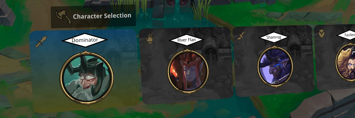
The Carousel component is popular and used in many games on various platforms.
Creating a carousel menu in Gameface is straightforward using the Carousel component, which can be customized to suit our requirements with minimal adjustments. Additionally, leveraging the Data Binding feature in Gameface allows us to do dynamic initialization and visual modifications of the carousel menu.
This is not a full guide covering every line of code, as the complete sample demonstrating carousel usage is accessible within the Gameface package. You can find it in the ${Gameface package}/Samples/uiresources/UITutorials/carousel-perspective directory.
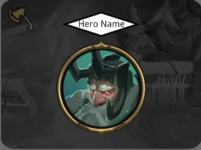
Layout of the Hero Item
Initially, we will focus on the design of how the carousel item will look - the layout and the styling of it. Then we are going to proceed with the integration of the carousel and its usage.
Carousel Item Layout and Styles
This is going to be the layout:
1<div class="carousel-item">2 <div class="hero-class"></div>3 <div class="hero-name">Hero Name</div>4 <div class="hero-avatar"></div>5</div>Since we are going to have this layout in the carousel item slot, we named it accordingly and styled it:
1.carousel-item {2 position: relative;3 width: 400px;4 height: 300px;5 background-image: url('../assets/item_background_bw.jpg');6 background-repeat: no-repeat;7 border-radius: 7%;8 perspective: 800px;9}We are going to use perspective to achieve a nicer transition effect while navigating through the carousel menu.
For the full styling, check the CSS file in src/main.css.
Our Requirements
We want a background that is going to change when an item is selected, an animation for the name of the hero and its avatar and have a class image for the hero.
The inner elements of the .carousel-item are sized and positioned accordingly.
Additionally, we are preparing for the animations to be added to the name and the avatar elements when changing the current carousel item.
1.hero-name,2.hero-avatar {3 transform: translateX(-50%) translateZ(0px);4 transition: transform 0.3s ease-in;5}As for the background, we are going to use the .carousel-item element by adding a linear-gradient as a second background.
1.carousel-current-item .carousel-item {2 background-image: linear-gradient(rgba(0, 100, 170, 0.5), rgba(100, 100, 0, 0.5)),3 url('../assets/item_background_bw.jpg');4}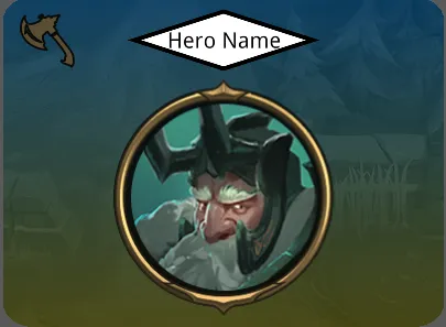
For the name and avatar there is going to be a simple transformation with translateZ to smoothly pop out those elements.
1.carousel-current-item .hero-name,2.carousel-current-item .hero-avatar {3 transform: translateX(-50%) translateZ(100px);4}The idea here is to dynamically set a class on a (carousel) wrapper and style accordingly when transitioning from one item to another and we are going to use the .carousel-current-item class for that.
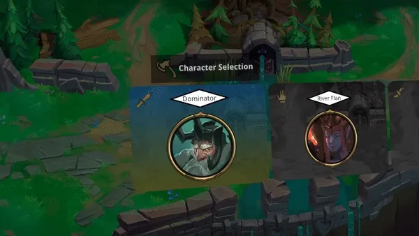
Carousel Component Integration
Since we are ready with our design, it is time to integrate, style and use the Carousel component.
Setup Walkthrough
- Run
npm iin the root folder of the sample which holds the package.json with the carousel component - In the html file src/index.html the component must be placed in the
<body>:
1<script src="../node_modules/coherent-gameface-carousel/dist/carousel.development.js"></script>Usage
Now it is time to not only place our HTML layout in the carousel but also explain how to utilize the Data Binding of Gameface.
Carousel Usage
You can paste the layout we already created and duplicate as many items as you like in the slot="carousel-slot" element to try it out.
1<gameface-carousel class="carousel-component">2 <div slot="carousel-content" class="carousel-item-wrapper">3 <!-- The layout for the carousel item. You can add the one from above.-->4 </div>5</gameface-carousel>If you only need the carousel (without the data binding), add only the layout we created and the carousel can be used in its full potential.
Carousel Interaction
We have added an event listener and used a function to toggle the .carousel-current-item class according to the current carousel item using the available Carousel currentItemIndex setter.
1document.addEventListener('keydown', (event) => {2 const keyCode = event.keyCode;3 if (keyCode === 37) {4 changeCarouselCurrentItem(-1);5 } else if (keyCode === 39) {6 changeCarouselCurrentItem(1);7 }8});For the full code - check the src/index.js file.
Usage with Data Binding
From now on we are proceeding with the additional properties we are going to need for the Data Binding .
1<gameface-carousel class="carousel-component">2 <div3 slot="carousel-content"4 class="carousel-item-wrapper"5 data-bind-for="hero:{{game.heroes}}">6 <!-- This is our layout with the additional data-bind-* properties-->7 <div class="carousel-item">8 <div class="hero-class" data-bind-style-background-image-url="{{hero.classImage}}"></div>9 <div class="hero-name" data-bind-value="{{hero.name}}"></div>10 <div class="hero-avatar" data-bind-style-background-image-url="{{hero.avatarImage}}"></div>11 </div>12 </div>13</gameface-carousel>Data Binding (Mocked) Model
We need 2 more scripts to initialize and use the data binding provided with Gameface:
1<script src="cohtml.js"></script>2<script src="model.js"></script>In short, the model.js creates a JS (mocked) model with the heroes - their names and avatar and class image paths for the data binding to use. Make sure to check the use of engine.createJSModel .
Check the src/index.js file and also note the use of engine.whenReady .
So now when running the sample in the Gameface Player , the data-bind-for property is populating elements according to the model and setting the name for the hero and the class and avatar images.